Tigmi.
Trusted by Designers, Agents and Homeowners

Color, Materials & Lighting Guide

Palettes, textures, and lighting layers that create depth and warmth.

1-2 mintypical render time
100%architecture preserved
2,847projects completed

First render free • Uploads stay private. Delete any time.

  • Instant results
  • Room Lock™
  • Light Lock™
  • Style Engine™
Client photoAI Decor Studio
Before interior
BeforeOriginal room
AfterAI redesigned

How it works

Three simple steps to transform your space

1

Upload photo

Drag & drop your room photo or click to browse

2

Pick style

Choose from 16 designer-curated styles

3

Get results

Download photorealistic redesign in minutes

See the transformation

Real rooms, real results. Our AI preserves your architecture while creating stunning makeovers.

Before makeover
After makeover
Before makeover
After makeover

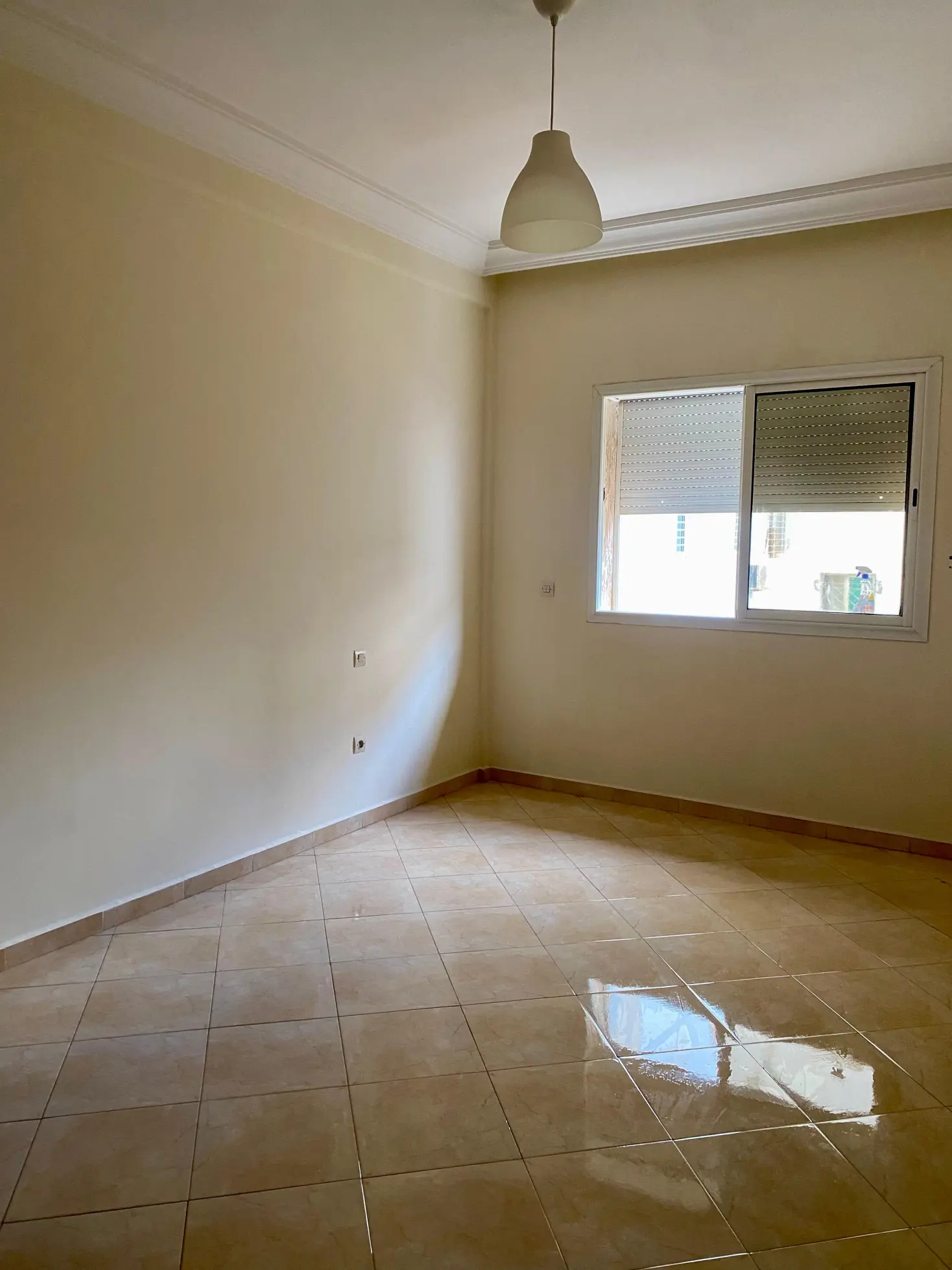
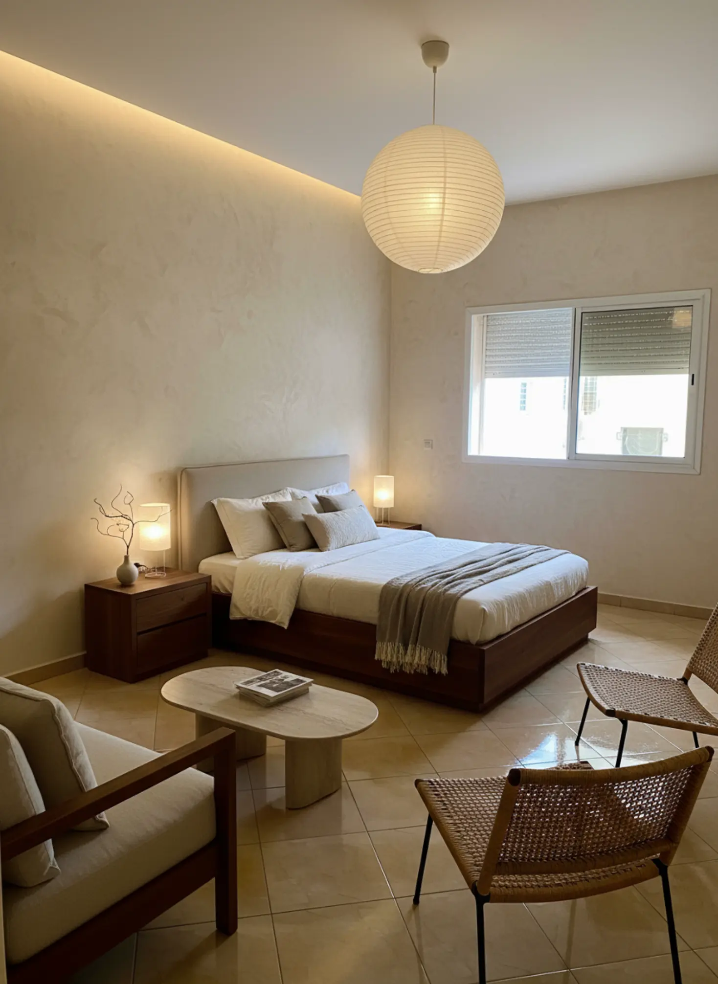
Bedroom Redesign: Transformed a cluttered bedroom into a modern, minimalist haven.

What our AI preserves

  • Room proportions

    Ceiling height, wall dimensions, and spatial relationships

  • Natural lighting

    Window placement, light direction, and shadows

  • Architectural details

    Moldings, built-ins, and structural elements

  • Camera angle

    Maintains your original perspective and framing

Ready to transform your space?

Upload your room photo and see the magic happen in minutes.

Try it free now

Color, Materials & Lighting Guide

Color, Materials & Lighting Guide is the foundation of every room that feels coherent, comfortable, and expensive in the right way. Get the mix wrong and even well-made furniture can feel flat, harsh, or awkwardly disconnected; get it right and the same room suddenly feels calmer, warmer, and more intentional. This matters now because more people are designing around existing architecture, natural light, and durable finishes instead of chasing fast trends that age badly. Tigmi helps you test those decisions in your own space before you commit, so you can see how paint, wood, stone, and light actually behave together throughout the day.

Palettes, textures, and lighting layers that create depth and warmth.

Understanding Color, Materials & Lighting Guide

Color, Materials & Lighting Guide is really about how three forces shape the experience of a room: what you see, what you touch, and how the space is illuminated. Color sets the emotional tone, materials add texture and depth, and lighting determines whether those choices feel soft, crisp, dramatic, or muddy. A warm white wall can look creamy beside oak and chalky beside marble, which is why context matters more than any single swatch. Materials also age differently, so a room should be planned for patina, maintenance, and daily use, not just first impressions. Natural light changes color temperature across the day, while artificial light can flatten or distort finishes if the wrong bulb temperature is used. That is why designers think in layers: ambient light for overall brightness, task light for function, and accent light for mood and focal points. The strongest interiors usually have a restrained palette, a clear material hierarchy, and lighting that supports the architecture rather than fighting it.

Current design trends are moving toward tactile, grounded spaces with fewer high-gloss surfaces and more honest materials. You are seeing more limewash, clay paint, plaster, white oak, walnut, travertine, honed marble, linen, bouclé, and brushed metal because these finishes absorb and reflect light in a softer, more livable way. Color direction is also shifting away from cold gray schemes toward earthy neutrals, muted olives, clay pinks, tobacco browns, inky blues, and chalky off-whites that work across seasons. In kitchens and bathrooms, matte and honed finishes are replacing overly polished surfaces, partly because they photograph better and feel less stark under LED lighting. There is also a growing preference for biophilic palettes that echo nature: moss, sand, stone, sky, and deep wood tones. On the market side, homeowners are prioritizing durability, low-VOC paints, FSC-certified timber, and performance fabrics that can handle real life without sacrificing style. The result is a more layered, less disposable approach to interiors.

AI and design technology are changing how people make decisions about color, materials, and lighting by reducing guesswork. Instead of buying samples and hoping they work, you can test combinations against your actual walls, windows, flooring, and daylight conditions before making a commitment. Tigmi is especially useful here because it preserves your room’s real architecture, so the proportions, window placement, and light direction remain true while you explore different style presets and finish combinations. That means you can compare a warm plaster palette against a cooler Nordic scheme, or see how oak, boucle, and brass behave in the same room with one click. Before/after comparisons make it easier to spot subtle issues, like a white that turns icy in north light or a wood tone that clashes with existing flooring. For designers, this speeds up early concepting and client alignment; for homeowners, it helps avoid costly mistakes; for agents, it supports faster, more convincing virtual staging decisions. The technology does not replace taste, but it gives you a much clearer starting point.

learnItems": ["How to choose a color palette that works with your room’s natural light, flooring, and fixed finishes", "How to pair materials such as oak, stone, linen, metal, and plaster so they feel intentional rather than busy", "How to layer ambient, task, and accent lighting for comfort, function, and visual depth", "How to spot undertones and finish mismatches before you buy paint, fabric, or furniture", "How to use Tigmi to compare design directions in your actual room before committing to a scheme"], "workflowSteps": ["Upload a photo of your room and use Tigmi’s room lock so the architecture, windows, and proportions stay fixed while you test different color and material directions", "Start with a style preset such as Japandi Calm, Modern Haven, or Nordic Light to establish a coherent baseline for palette, texture, and lighting mood", "Use before/after comparisons to check how a warm white, oak finish, or brass detail reads in your room at a glance, then refine the scheme based on contrast and undertone", "Save the strongest direction and share it with a contractor, designer, or client so everyone is aligned before ordering paint, finishes, or furniture"], "pitfalls": ["Choosing paint from a tiny swatch under store lighting, which often hides undertones that become obvious once the color is on a full wall", "Mixing too many competing finishes, such as cool gray stone, orange-toned wood, and blue-white paint, which creates visual friction instead of harmony", "Relying on overhead lighting alone, which flattens texture and makes even high-quality materials feel lifeless in the evening", "Ignoring the room’s fixed elements like flooring, countertops, and window orientation, which leads to a palette that looks right in theory but wrong in context"], "faq": [ {"q": "How do I choose a color palette that works with my room?", "a": "Start with the fixed elements in your room, especially flooring, countertops, and the direction of natural light. Then choose a main wall color, one supporting material family, and one accent tone that share a similar undertone, such as warm white with oak and brushed brass. This keeps the room from feeling disjointed and makes the palette read as intentional."}, {"q": "What materials work best for a calm, timeless interior?", "a": "Natural materials with visible texture usually age the best, especially white oak, linen, bouclé, plaster, honed stone, and brushed metal. These finishes soften light and create depth without relying on trend-driven shine. They also tend to feel more comfortable in everyday use because they look better as they wear."}, {"q": "Why does my paint color look different at home than in the store?", "a": "Because store lighting is controlled and often much cooler or brighter than your room. Your walls, floor, and daylight direction all change how a color reads, so the same white can look creamy, gray, or blue depending on context. Always test large samples in multiple spots and check them in morning, afternoon, and evening light."}, {"q": "What lighting layers do I need in a living room?", "a": "You need ambient lighting, task lighting, and accent lighting to create a room that works day and night. Ambient light gives overall brightness, task light supports reading or work, and accent light highlights artwork, texture, or architectural details. A room with only one ceiling fixture usually feels flat and less inviting."}, {"q": "How can I test materials and lighting before making expensive changes?", "a": "Use a room visualization tool like Tigmi to compare different palettes, finishes, and style directions in your actual space. That lets you see how your walls, windows, and existing architecture interact with new choices before you buy samples, furniture, or fixtures. It is one of the fastest ways to avoid expensive mismatches."} ], "expertTip": "When you are building a palette, start with the least changeable element in the room and work outward. If the floor is warm, avoid forcing a cool scheme unless you plan to balance it with equally deliberate accents and lighting temperature; otherwise the room can feel visually split. I also recommend checking every finish under both daylight and warm evening light, because a scheme that looks perfect at noon can turn flat or muddy after sunset.", "cta": "If you want to stop guessing about color, materials, and lighting, try Tigmi on your own room and see the right direction before you buy a single sample."

How to use this playbook

This playbook turns color, materials & lighting guide into decisions you can test in Tigmi. Use it to align mood, palette, and layout before you buy or renovate, then share it as a short brief with anyone involved.

Start broad with atmosphere and lighting, then narrow into materials, furniture scale, and finishing touches. Save your best Tigmi renders as checkpoints so the direction stays consistent from idea to execution.

Playbook snapshot

Use these signals to keep color, materials & lighting guide decisions aligned across layout, palette, and budget.

  • Goal: write the room story in one clear sentence.
  • Palette: pick one base, one accent, one contrast.
  • Materials: commit to a hero surface and one tactile fabric.
  • Lighting: plan daytime + evening layers before shopping.
  • Layout: keep one clean circulation path at all times.
  • Styling: choose one hero moment and repeat its cues.

What you'll learn

  • Neutral palettes that avoid flatness.
  • Material pairings that feel elevated.
  • Lighting layers for mood and clarity.

Playbook checklist

Use this checklist to keep color, materials & lighting guide decisions aligned from moodboard to final render.

  • Define the room goal and the feeling you want visitors to have.
  • Pick a primary palette plus two supporting accents.
  • Lock one hero material and one hero texture for the space.
  • Confirm lighting layers: ambient, task, and accent.
  • Set scale rules for seating, storage, and walkways.
  • Render three variations in Tigmi to compare color, materials & lighting guide directions.
  • Translate the best render into a shopping or renovation list.
  • Collect feedback and update the prompt once, not ten times.
  • Keep a running list of measurements so the layout stays realistic.
  • Decide one hero moment to anchor the styling story.

Prompt ideas for Tigmi

Start with these prompt angles, then refine them with your materials and lighting notes.

  • color, materials & lighting guide, warm neutral base, layered textures, soft daylight, editorial styling.
  • color, materials & lighting guide, high-contrast palette, sculptural lighting, minimal clutter, gallery vibe.
  • color, materials & lighting guide, natural materials, calm layout, cozy seating, golden-hour glow.
  • color, materials & lighting guide, modern classic mix, brass accents, tailored textiles, hotel feel.
  • color, materials & lighting guide, airy layout, open sightlines, matte finishes, curated art.
  • color, materials & lighting guide, tonal palette, plush textiles, soft curves, serene mood.
  • color, materials & lighting guide, bold focal wall, layered lighting, clean sightlines, premium feel.

Top topics to explore

Market playbooks

Common pitfalls to avoid

Avoid these missteps so color, materials & lighting guide outcomes stay polished and intentional.

  • Mixing too many styles at once; keep one hero direction.
  • Ignoring lighting direction; the same palette shifts under different light.
  • Over-scaling furniture; keep circulation clear in every layout.
  • Adding decor before the base finishes are locked.
  • Letting every surface compete; leave one area calm.
  • Skipping measurements and ending up with cramped sightlines.
  • Buying everything at once instead of staging in layers.

How to use Tigmi

  1. 1

    Choose a palette and list anchor materials.

  2. 2

    Render two variations with different lighting notes.

  3. 3

    Save the strongest option and share with your household.

Playbook FAQs

Which playbook should I start with?

Start with the pillar that matches your goal (tools, room ideas, staging). Create one Tigmi render, then branch into related topics.

Do I need professional design software?

No. Tigmi renders plus this playbook give you a clear direction, then you can shop or brief a contractor with confidence.

How often should I update my prompts?

Update whenever you change layout, palette, or lighting. Keep older renders as references so the direction stays steady.

Ready to create?

Build a palette with Tigmi.

Start with Tigmi →

Explore more with Tigmi

Ready to transform your space?

Upload your room photo and see the magic happen in minutes.

Try it free now

Upload a room photo and get a designer level makeover in minutes

Try your room free