What an accent color is, what red, blue, green, terracotta and other accents say in a room, and how to pick one that works with your light and materials.
- ✓ An accent color is the color you use least, about 10% of the room, so the eye lands on it.
- ✓ Meanings are associations, not rules: red reads as energy, blue as calm, green as nature, terracotta as warmth.
- ✓ Pick it from what you keep (floor, sofa, wood) and the light, repeat it three times, and test before painting.
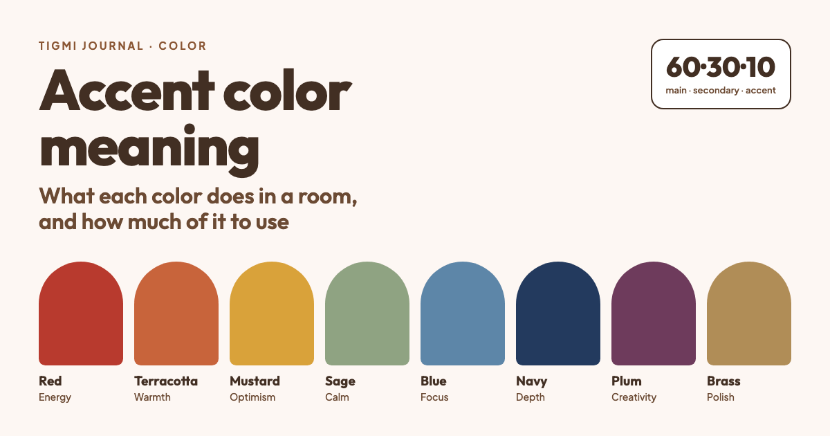
An accent color is the color you use a little of, on purpose, so the eye knows where to land. It’s the rust cushion on a grey sofa, the navy front door, the green lamp on an oak sideboard. People search for its meaning because they want to know what a color will do to a room before they paint or buy anything, so this guide covers both: what each common accent says, and how much of it to use.
One honest note before the list. Color psychology is real but softer than most charts suggest. Studies show color can affect mood and attention, yet the effects depend heavily on the exact shade, the context and the culture you grew up in (Elliot & Maier, 2014). Treat the meanings below as associations most people share, not as rules.
What counts as an accent color
A room usually has three layers of color:
- Main color (about 60%): walls, large rugs, the biggest furniture.
- Secondary color (about 30%): curtains, an armchair, cabinetry, a headboard.
- Accent color (about 10%): cushions, art, a vase, a lamp, a painted door or one wall.
That split is the well-known 60-30-10 rule. It isn’t a law, but it explains why an accent works: it’s the color you see least, so it’s the one that stands out. Paint a whole room in your “accent” and it becomes the main color, with a completely different effect.
Contrast matters more than brightness. In a white room a charcoal lamp is an accent; in a dark green library a cream throw is.
Accent color meanings, one by one
Red: energy and appetite
Red is the loudest accent. It reads as energetic, warm and confident, and it is traditionally linked with appetite, which is why it shows up in dining rooms and kitchens. A little goes a long way: one red chair or a red runner is enough in most rooms. Brick and oxblood reds are easier to live with than pure red.
Works well in: dining rooms, kitchens, entryways. Go easy in: bedrooms and small offices.
Terracotta and burnt orange: warmth and welcome
Terracotta is red’s friendlier cousin. It feels earthy, sunny and sociable, and it pairs naturally with wood, linen, cane and plaster, which is why it’s everywhere in Mediterranean, Moroccan and organic modern rooms. It is one of the safest accents to add to a beige or grey room that feels flat.
Works well in: living rooms, terraces, reading corners.
Yellow and mustard: optimism
Bright yellow reads as cheerful and energetic; mustard and ochre read as warm and a little retro. Yellow is the accent that most changes with light: lovely in a north-facing room that needs warmth, harsh in direct afternoon sun. Mustard is easier to use than lemon yellow.
Works well in: kitchens, kids’ rooms, north-facing rooms.
Green: calm and nature
Green is the most forgiving accent because we’re used to seeing it next to everything outdoors. Sage and olive feel calm and grounded; emerald feels rich and a bit glamorous. Plants count: a large plant is a green accent you can move.
Works well in: almost anywhere, especially bedrooms, bathrooms and home offices.
Blue: calm, trust and focus
Light blues feel airy and restful; mid blues feel fresh; navy feels deep, serious and tailored. Blue is often chosen for bedrooms and studies because it reads as calm. Navy is one of the few accents that also works as a “neutral” with almost any wood tone.
Works well in: bedrooms, studies, bathrooms. Pairs well with: brass, white oak, terracotta.
Teal and turquoise: fresh and lively
Teal sits between blue’s calm and green’s freshness. It’s a strong accent in a neutral room and pairs well with warm metals and rust tones (the classic teal-and-orange contrast).
Purple: creativity and luxury
Deep plum and aubergine read as rich and dramatic; lavender and lilac read as soft and gentle. Purple is less common, which is exactly why it gets noticed. It suits a velvet chair, a headboard or a piece of art more than a wall.
Pink and blush: softness and warmth
Blush and dusty pink feel warm and relaxed rather than “sweet”, especially next to grey, green or black. A deeper raspberry pink works as a bold accent the way red does, with less aggression.
Black and charcoal: definition
Black is an accent when the room is light. A black lamp, picture frames, window frames or chair legs give a room outlines, which makes it look more finished. Too much black in a small, dark room makes it feel smaller.
Brass, gold and copper: warmth and polish
Metallic accents read as warm and a little luxurious. They also reflect light, so they work in darker corners. Keeping to one main metal looks calmer; mixing two is fine if one clearly leads.
How to choose your accent color
1. Start from what you’re keeping. Look at the floor, the sofa and any wood. Warm wood (oak, walnut, teak) loves terracotta, mustard, olive and navy. Cool grey floors and white walls take blue, green, black and blush well.
2. Check the light. North-facing rooms get cool, even light, so warm accents (terracotta, ochre, blush) make them feel cozier. South- and west-facing rooms get warm light that can make yellows and oranges look intense; greens and blues stay balanced.
3. Match undertones. Every color leans warm or cool. Two accents work together when they share an undertone: terracotta with mustard, navy with teal, sage with blush.
4. Repeat it at least three times. One red cushion looks like an accident. A red cushion, a print with red in it and a red book spine across the room look like a decision.
5. Test before you paint. Paint samples look different at 9 am and 9 pm. Try a large sample on two walls for a couple of days, or try the color on a photo of your room before buying anything.
Where to put an accent color
From easiest to most committed:
- Textiles: cushions, throws, a rug border, curtains with a pattern.
- Objects: vases, lamps, books, art, ceramics.
- One furniture piece: an armchair, a side table, a painted dresser.
- Architecture: a door, window frames, the inside of shelves, a ceiling.
- One wall: usually the wall you see first when you walk in, or the one behind the sofa or bed.
Start at the top of the list. Textiles and objects cost little and move easily; a painted wall is the step to take once you’re sure.
Common mistakes
- Too many accents. With three bright colors, none of them is the accent any more.
- An accent with nothing to repeat it. One isolated object looks out of place.
- Ignoring the main color’s undertone. A cool blue accent on a warm cream wall can look grey and dull.
- Choosing from a tiny chip. Colors get stronger on large surfaces. Go one shade softer than the chip you love for walls.
See it on your own room first
The fastest way to know what an accent will do is to see it in the room itself. Upload a photo of your room to Tigmi, choose a style and add a short note such as “terracotta cushions and a rust throw” or “a navy accent wall behind the sofa”. You get a redesign of your actual room in a minute or two, and the free plan includes 3 designs a month, so you can try a few accents and compare them before you buy paint.
For the short definition, see accent color in our glossary.
Tigmi Team
Product & EditorialThe people who build Tigmi, an AI tool that redesigns real rooms from a single photo. We write about what we learn testing styles, prompts and room photos every day.
Frequently Asked Questions
What is an accent color in interior design?
An accent color is the color used in small amounts to draw the eye: a cushion, a lamp, a piece of art, a door or one wall. It usually covers around 10% of what you see in a room, against a calmer main color and a secondary color.
What does an accent color mean?
Colors carry associations: red reads as energy, blue as calm, green as nature, terracotta as warmth. These are associations rather than rules. The exact shade, the light in the room and how much of the color you use change the effect more than the color name does.
How many accent colors should a room have?
One is the safest choice, two can work if they share an undertone (for example terracotta and mustard, or navy and teal). With three or more, nothing stands out any more and the room starts to look busy.
Can an accent color be neutral?
Yes. Black, charcoal, deep brown or brass often work as accents in a light room, because the contrast is what makes something an accent, not how saturated the color is.
Ready to see your room reimagined?
Upload a photo of your room and get a photorealistic redesign in a couple of minutes. Your first 3 redesigns each month are free.